Some aspects of design from the perspective of a woman designer
Sheila Levrant de Bretteville, 1973
Некоторые аспекты дизайна с позиции дизайнерки
Шила Левран де Бреттевилль, 1973
INTRODUCTION
Введение
The design arts are public arts, and as such are major vehicles for forming our consciousness. Consciousness, in turn, is illuminated by communications, objects, buildings and environments. The design activity stands between us and our material existence, affecting not only our visual and physical environment but a sense of ourselves as well.
The process by which forms are made, and the forms themselves, embody values and standards of behavior which affect large numbers of people and every aspect of our lives. For me, it has been this integral relationship between individual creativity and social responsibility that has drawn me to the design arts. It is possible and profitable to reinforce existing values through design. In my work, however, I try to project alternative values into society in the hope of creating a new, even utopian culture, by acting in accordance with values of my own choosing.
We can look at design and actually read its messages—thus we can locate, create and use positive modes which reject the repressive elements of dominant culture. I have been trying to use forms and processes which project and reassert aspects of society which—though of essential value—have been repressed, devalued and restricted to women in the private realm of the home.
As I become increasingly sensitive to those aspects of design which reinforce repressive attitudes and behavior, I increasingly question the desirability of simplicity and clarity. The thrust to control almost inevitably operates through simplification.
Control is undermined by ambiguity, choice, and complexity, because subjective factors in the user become more effective and the user is invited to participate. Participation undermines control.
The oversimplified, the unremittingly serious, the emphatically rational are the consistent attitudes associated with work adopted by major institutions and the men and few women who inhabit them. In the circle of cause and effect, these attitudes are reinforced and reproduced as they are visually and physically extended in our environment.
One means of simplification is to assign attributes to various groups and thereby reinforce divisions. The restriction of certain behavior to the home and the making of women into the sole custodians of a range of human characteristics create a destructive imbalance. The design arts reinforce this imbalance by projecting the ’male’ tone only in the public realm of our large institutions: business, science, the military and even education, valuing their anonymous, authoritarian aspects and separating themselves further and further from the private realm, thus continuing to isolate women, female experience and ’female’ values.
Дизайн — это публичная практика, и потому это один из главных механизмов, формирующих наше сознание. Сознание, в свою очередь, становится видимым через коммуникации, объекты, здания и окружающие среды. Дизайнерская деятельность располагается между нами и материальным миром: она изменяет не только наше визуальное и физическое окружение, но и ощущение себя.
И процесс создания дизайнерских форм, и сами эти формы отражают ценности и нормы поведения, которые влияют на множество людей и на все аспекты нашей жизни. Именно эта неразрывная связь между личным творчеством и социальной ответственностью привлекает меня в дизайне. Через дизайн можно усиливать уже существующие ценности — с выгодой для дизайнера. Впрочем, в своей работе я стараюсь продвигать другие ценности, в надежде создать новую, даже утопическую культуру, опираясь на собственный ценностный выбор.
Можно смотреть на дизайн и считывать его смыслы — а значит, можно обнаруживать в пространстве, а также создавать и использовать виды позитивной деятельности, которые направлены против репрессивных элементов доминантной культуры. Я стараюсь придерживаться форм и процессов, которые акцентируют и пересматривают те аспекты жизни общества, что — будучи неоспоримо значимыми — были подавлены, обесценены и ограничены для женщин частной домашней сферой.
Чем чувствительнее я становлюсь к аспектам дизайна, которые закрепляют репрессивные взгляды и поведение, тем критичнее я воспринимаю стремление к простоте и ясности. Жажда власти почти неизбежно реализуется через упрощение. Любая неопределенность, свобода выбора или сложность подрывает контроль, потому что для пользователя становятся важнее субъективные факторы, и тем самым она приглашается к участию. Участие подрывает контроль.
Чрезмерно упрощенный, непреклонно серьезный, подчеркнуто рациональный — такой взгляд на рабочие процессы принят в крупных учреждениях среди мужчин и немногих женщин. В замкнутом круге причин и следствий этот взгляд подкрепляется и воспроизводится, распространяясь в нашей среде на визуальном и физическом уровне.
Один из способов упрощения — присваивать ярлыки разным группам и таким образом разделять их еще сильнее. Выбрать среди общечеловеческих качеств особые, исключительно женские свойства, свести их проявление к домашней сфере — значит, создать вредный дисбаланс. Дизайн его лишь подчеркивает: «мужской» тон подходит только для публичных мест. В крупных учреждениях — деловых, научных, военных и даже образовательных — это усиливает анонимность и авторитарность и всё больше отделяет их от частной сферы, таким образом, продолжая изолировать женщин, женский опыт и «женские» ценности.
MASS MEDIA AND COMMUNICATIONS, A DIAGRAM OF SIMPLIFIED SEPARATION
СМИ И КОММУНИКАЦИИ: РАЗДЕЛЕНИЕ ЧЕРЕЗ УПРОЩЕНИЕ
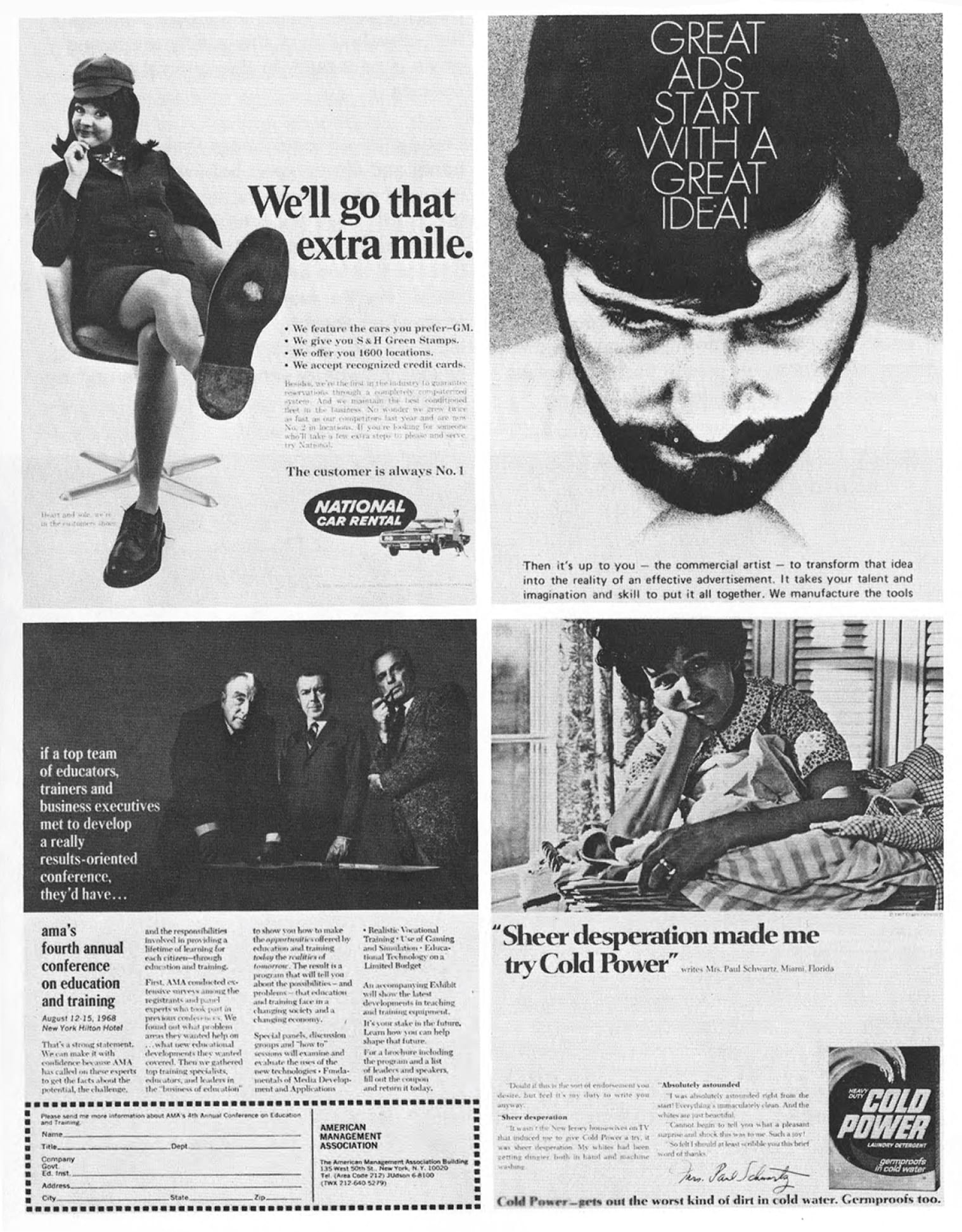
The mass media have a tradition of visual simplification in order to isolate their messages to attract attention. This simplification denies the complexity of life’s experience. Simple statements, familiar and repeated imagery, sell the product and the idea most efficiently. They also reinforce restricting separations.
In advertising, women are described as, or permitted to be, laughing, crying, doubting, making mistakes, hesitating: women alone are seen as nurturing or as providing emotional support for children and men. When, for example, a company represents itself in a service capacity or as particularly accommodating, it uses a female figure and reinforces traditional attitudes by this symbolic imagery.
The iconography for men is equally rigid. Men in work situations are shown as serious, decisive, professional, assured. No emotions, no fantasy; the few moments of relaxation or emotion permitted to men are relegated to leisure and the home.
Likewise, the home becomes devalued as a place where no serious work can be done. As the woman is virtually seen only in the home, she too is devalued. By depicting women as exclusively emotional, doubting, cooperating, and helping others, by only showing these activities in private, in the home, the polarities of what men and women are thought to be are reinforced and legitimized. In fact, the very characteristics that are allowed in women in the home, prevent success in the competitive public sector.
If the idea and the design are simple, complete and set, there is no opportunity to bring one’s own values to the forms. If there is no ambiguity the eye is attracted once, the message understood and accepted quickly. When visual material is ambiguous the different nuances often encourage multiple and alternative reactions to the same communication. Were the mass media to include contradictions; were its images to contain suggestions rather than statements, the viewer could make an effort to bridge the gap, to interpolate, extrapolate, participate. But this is not the goal of mass media communication.
Design as a problem-solving activity is assumed to involve only the acceptance by the designer of the aims of the client. If the client’s goal is to sell a product or idea quickly, the problem does not include the encouragement of a thinking audience.
The modern movement in design encouraged a simplicity and clarity of form. This mode was embraced by some of the most creative and intelligent designers. It became fashionable to simplify for the clarity and power of the image, but as design becomes fashion, simplification becomes pernicious. This simplification in form and process leads to restricting and limiting separations and boundaries. By relaxing boundaries, by allowing more complexity in the image, designers could prevent this kind of visual fascism.
The reawakening of feminism has renewed the demand that the social expectations for both men and women be broadened, enabling all to participate freely in the social system according to the full range of their personalities, and allowing all individuals to create their behavior from the whole spectrum of possibilities. Not only will we not know what immutable differences exist until expectations change, but the very values which are devalued and suppressed are consequently unavailable in viable form to both men and women.
В СМИ есть традиция упрощать визуальный материал, чтобы выделить сообщение, привлечь к нему внимание. Такое упрощение стирает многообразие живого опыта. Простые утверждения и повторы знакомых образов эффективнее всего продают идею или продукт. А также — усиливают границы и разделение.
В рекламе женщина — ей это разрешено — смеется, плачет, терзается сомнениями, ошибается, раздумывает; в женщине видят воспитательницу или эмоциональную опору для ребенка и мужчины. Например, если компания выступает в сфере обслуживания или хочет показать особую заботу о клиентах, она будет использовать женскую фигуру [в рекламе] и через это символическое изображение поддерживать традиционные взгляды.
Иконография мужчин — столь же жесткая. Мужчины на работе изображаются как серьезные, рассудительные, уверенные профессионалы. Никаких эмоций, фантазии; редкие моменты, когда мужчине позволено расслабиться или дать волю эмоциям, сводятся к сферам досуга и личной жизни.
В том же духе обесценивается дом — как место, где нельзя заниматься серьезной работой. Поскольку мы видим женщину только в домашней обстановке, она тоже обесценивается. Изображая женщин, которые только дома проявляют эмоции, сомневаются, объединяются и помогают другим, — мы усиливаем и легитимизируем контраст между общепринятыми образами мужчины и женщины. В целом, свойства, которые женщине разрешено проявлять дома, не позволяют ей достичь успеха в конкурентной публичной среде.
Если идея и дизайн просты, завершены и заранее заданы, внедрить в эту форму свои собственные ценности не получится. Если мы с первого взгляда не находим двойственности в сообщении, оно мгновенно становится понятным и принимается. Когда же визуальный материал имеет подтекст, его нюансы в рамках той же коммуникации вызывают самые разные реакции. Если бы СМИ отражали противоречия, если бы изображения содержали предположения, а не утверждения, зритель мог бы сам соотнести их, заполнить между ними пропуски, сделать обобщения, соучаствовать. Но у коммуникации в СМИ другая задача. Считается, что дизайн как решение проблем сводится к тому, что дизайнер перенимает задачи клиента. Когда задача клиента — быстро продать продукт или идею, она не включает в себя работу с думающей аудиторией.
Современные течения в дизайне выступают за ясность и простоту форм. Так работают самые креативные и умные дизайнеры. Стало модно упрощать образ, чтобы сделать его ярче и сильнее, но как только дизайн превращается в моду, упрощение становится вредным. Упрощение форм и действий приводит к разделениям и границам, которые сдерживают и запрещают. Ослабляя границы, усложняя образы, дизайнеры могут остановить этот своего рода визуальный фашизм.
Новая волна феминизма вновь поставила вопрос о расширении социальных ожиданий у женщин и мужчин, чтобы они могли действовать в социальной системе, свободно и полно выражая свою личность, чтобы они вели себя, исходя из всего диапазона возможностей. Мы не узнаем, какие различия непреодолимы, пока не изменятся ожидания; более того, сами ценности, которые обесцениваются и подавляются [в обществе], останутся невидимыми для мужчин и женщин.
Designers could help to revalidate what have been designated as ’female’ values and devalued as such.
Дизайнеры могут помочь в переоценке ценностей, которые обозначались как «женские» и тем самым обесценивались.
PUBLICATIONS, SOME ALTERNATIVE MODES
ПУБЛИКАЦИИ: НЕСКОЛЬКО АЛЬТЕРНАТИВНЫХ ВАРИАНТОВ
People aware of design and its responsibilities are developing a design activity based on an ideology which encourages the emergence of the direct voice of the individuals who compose society.
The movements of the sixties questioned the structures and institutions that engender conformity. Alternative modes began to be developed that pointed out the limitations of hierarchical, one-directional channels of communication. For example, modern offset printing technology has begun to be used to create a model for participatory politics. By compiling a catalogue of goods and services recommended by a large number of contributors across the country, The Whole Earth Catalog reestablished the value of individual subjectivity and designed a structure that encouraged user participation. This effort, as well as others of the youth, hippie, human-potential, counter-culture movements, helped validate some repressed ’female’ values, and encouraged the growth of the women’s movement.
Люди, понимающие, что такое дизайн и какова его зона ответственности, выбирают для своей деятельности такую идеологию, которая дает голос индивидам, составляющим общество.
Движения 1960-х годов подвергли критике те структуры и учреждения, которые порождали конформизм. Стали развиваться альтернативные практики, которые указали на узость иерархической, односторонней коммуникации. К примеру, современный метод офсетной печати стал моделью партиципаторной политики. The Whole Earth Catalog собрал рекомендации о товарах и услугах от участников со всей страны. Он предложил формат, побуждающий пользователей к участию, и тем самым вновь сделал субъективность значимой для человека. Эти усилия — наравне с контркультурой, хиппи, движением за развитие человеческого потенциал, разными молодежными течениями — отстаивали замалчиваемые «женские» ценности и поддерживали движение за права женщин.

A similar attitude pervaded my design for a special publication for the International Design Conference in Aspen. Usually, six months after the conference, the participants receive a booklet containing excerpts of the speeches and comments by established and rising stars. Rather than impose my own understanding through this kind of control and simplification, I composed a newspaper of the direct voices of those participants who chose to record their experiences.
Cards were distributed on which any comments a participant might want to make could be written, drawn or typed. On the last night, these panels were glued together directly, forming pages. Then, through the use of an inexpensive, quick, rotary form of offset lithography, the newspaper was available in the morning. The distribution and assemblage of standardized panels created a nonhierarchical organization. All spreads were virtually alike, not one dominated, and all invited the readers to participate through choosing which entries to read and in what order. It is the readers who must create and combine these fragmented responses into their own personal picture of the conference. It was the participants who chose the fragments, the reader who organized them individually.
Я придерживалась схожих взглядов, когда готовила материалы к публикации для Международной конференции дизайнеров в Аспене. Как правило, через полгода после конференции участники получают буклет с выдержками из выступлений и комментариями знаменитостей и восходящих звезд. Вместо того, чтобы насаждать свою точку зрения через упрощенную и властную форму, я составила газету, где все желающие сами рассказывали о своем опыте участия в конференции.
Я раздала участникам карточки, на которых каждый мог написать, начертить или напечатать любые комментарии, какие захочет. В последний вечер конференции мы сложили карточки вместе, чтобы получились страницы. Благодаря недорогой и быстрой технике офсетной печати газета была готова к утру. Раздав и сложив вместе однотипные листы, мы создали порядок без иерархии. Ни один разворот не забивал остальные, они были практически одинаковы, приглашали читателей к участию, позволяя выбирать материалы и читать их в любом порядке.
Именно читатель должен был сам создать, собрать из фрагментарных ответов свой образ конференции. Участники выбирали фрагменты, а читатель сам их упорядочивал.
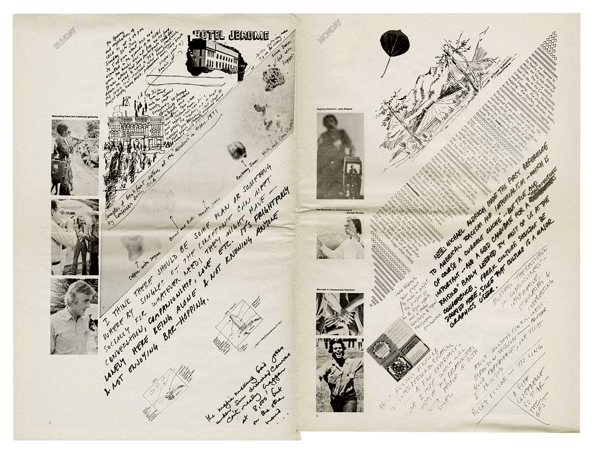
As a designer, I created the structure that facilitated this process. The visual form of this newspaper was not the result of an effort to use a new form; new material, or new technological process, nor to develop a new or personal style. The forms were developed first to accord with a social context, to help achieve by their existence, the standard of behavior they reflected.
Как дизайнерка я создала структуру, которая обеспечила весь процесс. Визуальное решение этой газеты для меня — не результат исследования новой формы, материала или технологии, не поиск своего стиля или персональной манеры. С самого начала я задумала его для работы с социальным контекстом, чтобы это решение помогало достичь определенного стандарта поведения.
The forms are the visual expression of an effort to project information in such a way as to emphasize alternative standards of behavior, alternative modes of design.
На визуальном уровне новый формат пытался продвигать другие нормы, другой дизайн.
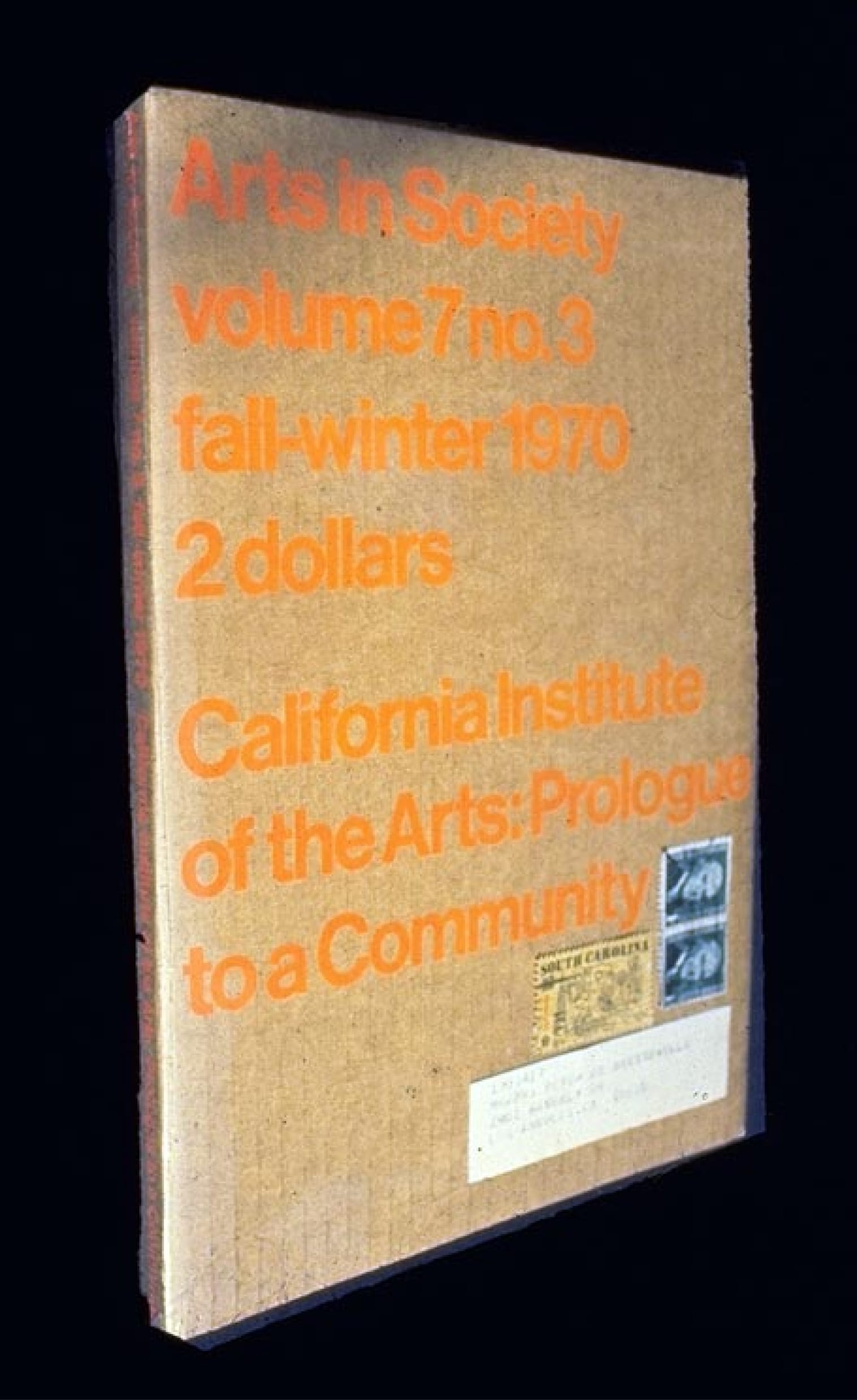
An increasing number of periodicals have begun to have guest editors, guest designers — Radical Software, Design Quarterly, Arts in Society, and others. As in the structure of The Whole Earth Catalog, special issues of publications provide alternatives to the small authoritarian establishment and expand the number of sources of information.
For example, I edited and designed a special issue of Arts in Society about California Institute of the Arts, a new community of the arts. The schools of this new institute were to open in one year, and I tried to create a graphic model that would reflect the formation of an alternative learning situation. These schools were being created by men who had been successful in the cultural establishment and were now creating an institution by working out some other ideas and goals, among them those of the movements of the sixties. I wanted to devise a design which would project the concepts of a horizontal person-centred community. Every design decision was made to reinforce these concepts through the form of the publication.
I chose several types of visual and textual material and organized them in waves of information. Letters between the Provost and future faculty members were scattered throughout the magazine, as well as taped fragments of dean’s meetings, memoranda, student applications. These were interspersed with photographs from television and newspapers that described the social context of the United States during the decade in which the institute was being planned. The organization of the magazine purposefully avoided the presentation of information in a simple, clearly logical linear manner. Instead, it was diffuse and depended on repetition of similar content, similar forms, cycles, leitmotifs, in both the writing and the imagery.
Все больше изданий стали приглашать редакторов, в том числе дизайнеров — Radical Software, Design Quarterly, Arts in Society и другие. Как и в случае с The Whole Earth Catalog, специальные выпуски предлагали альтернативу авторитарному истеблишменту и расширяли доступ к информации.
К примеру, как редакторка и дизайнерка я готовила специальный выпуск журнала Arts in Society. Он был посвящен Калифорнийскому институту искусств, новому арт-сообществу. Институт должен был открыться через год, и я хотела создать графическую модель, которая бы показала, как формируется альтернатива в сфере образования. Институт создавали мужчины, добившиеся успеха в сфере культуры; они хотели воплотить в нем новые идеи, в том числе идеи из движений 1960-х. Я разрабатывала дизайн, чтобы передать в нем принципы горизонтальных связей между людьми. Каждое мое дизайнерское решение было призвано укрепить эти принципы за счет самой формы.
Я отобрала несколько типов визуального и текстового материала и организовала их как информационные волны. Переписка провоста с будущими сотрудниками была разбита на фрагменты по всему журналу — как и стенограммы заседаний, отчеты, заявки абитуриентов. Всё это перемежалось фотографиями из телевизионных программ и газет, где описывался социальный контекст США 1960-х годов.
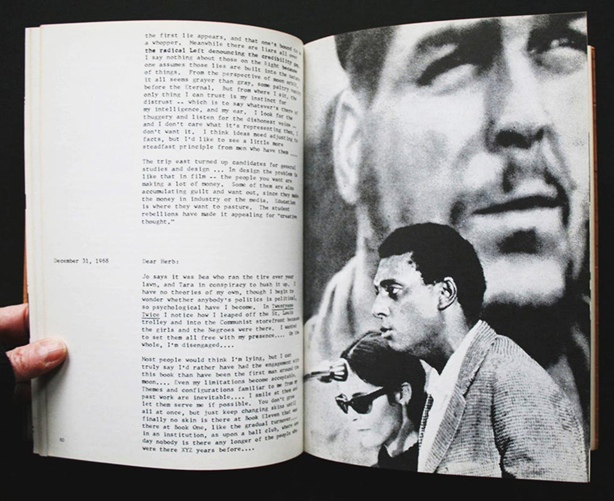
Many aspects of the book had to be reconceptualized and reorganized. The traditional table of contents, and its position in the book was not an appropriate form for introducing material. I substituted an alphabetical index placed after the first signature that included each type of information to be encountered in the book. Throughout the magazine, the author is listed by name only, and in the index, in alphabetical order. This was done in an effort to avoid hierarchy and authority and to guide the reader to a different way of reading.
The tentativeness of fragmented organization encouraged the reader to participate in the ultimate conceptualization of the community. Since California Institute of the Arts was yet to open, and consequently, was not clearly defined, its character could, in some sense, be shaped by the individual reader’s subjective response. I felt that it was possible to establish a real and dynamic relationship between the institute and a readership. The nonhierarchical, fragmented organization, the diffusion of formal elements had become attractive to me as a visual projection of alternative modes of relationship. Certainly it is an alternative to the method of projecting set, simplistic messages that distort communications in the mass media.
Разрабатывая журнал, я сознательно отказалась от подачи информации в простом, ясном, логичном, линейном виде. Напротив, он был разрозненным, и многое зависело от повторов материала, формы, от циклов, лейтмотивов — как в текстах, так и в иллюстрациях. Многие аспекты пришлось продумывать заново и переделывать. Ни традиционное оглавление, ни его место в журнале не подходило для такой подачи материала. Вместо оглавления в начале я поместила алфавитный указатель с терминами, которые можно встретить на журнальных страницах. Автора можно было найти в указателе по алфавиту. Это помогло избежать иерархии и авторитарности и показать читателю другой порядок чтения.
Фрагментарность материалов означала, что журнал не завершен, — тем самым читатель приглашался к участию, к более полному осмыслению сообщества. Поскольку Калифорнийский институт искусств ещё не был открыт — а значит, его образ не был ясно определен, описывать его мог сам читатель. Я чувствовала, что мы можем установить настоящую, активную связь между институтом и читающей публикой. Организация без иерархии, через фрагменты, рассредоточенность компонентов формы привлекали меня как способ отобразить альтернативные отношения. Очевидно, это была альтернатива заранее заданным, упрощенным сообщениям в СМИ, которые искажали коммуникацию.
Projecting data in a clear, systematized manner is most sensible in the communication of certain types of information, such as maps and catalogs, but when it is used to communicate ideas or information about people and their relationships, it distorts.
Ясное, систематизированное изложение данных подходит для конкретных типов информации — например, для карт и каталогов; но если мы передаем идеи или информацию о людях и отношениях между ними, такая форма их искажает.
Designers are taught to reduce ideas to their essence, but in fact that process too often results in the reduction of the ideas to only one of their parts. A more diffused manner of organizing material maintains enough complexity, subtlety, and ambiguity to entice the readers who normally dart away with someone else’s encapsulated vision, rather than remaining long enough and openly enough with the idea to make it their own. I invited students in my class at CalArts to investigate this form and process, using content that was personally meaningful to them. I asked them to create a whole of their own. The whole was to be greater than the sum of the parts. A woman student explained her solution:
«Its cryptic presence overshadows that of its ingredients. We recognize these symbols in an understanding of their total symbology (or at the very least, in a resolution that they may be unified meaningfully) .... Masculine hands describe, define, offer, repulse, threaten ... the only feminine elements are solely and grotesquely sensual-bodies fulfilling a seemingly obligatory sexual role, and hair-do’s delineating a faceless area, a nonexistent identity ... It seems that many of the superficial accoutrements of a culture are present, and yet little of the whole human being is seen. Despite the constant sexual innuendo, despite the care given to the tools of a communicative sort ... despite the hands that gesticulate and promise or threaten ... there is no real touching ... the accoutrements, the parts have less graphic, linguistic, and psychological importance than the whole.»
As the community becomes used to ambiguity, complexity, subtlety in design and content, it will be more able to support the formation of individual conclusions, the expression of individual subjective opinions and will advocate the sharing of authority. For me this is a good: that Design can encourage.
The organization of material in fragments, multiple peaks rather than a single, climactic moment, has a quality and rhythm that may parallel women’s ontological experience, particularly her experience of time. Although I came to use this fragmented organization in an effort to reflect a community of the arts in formation and to encourage the reader to participate, this form of visual organization corresponds more to a woman’s world.
There are several genres of women’s work, quilts and blankets, for example, which are an assemblage of fragments generated whenever there is time, which are in both their method of creation as well as in their aesthetic form, visually organized into many centers. The quilting bee, as well as the quilt itself, is an example of the essentially nonhierarchical organization. Certainly the quality of time in a woman’s life, particularly if she is not involved in the career thrust toward fame and fortune, is distinct from the quality of time experienced by men and women who are caught up in the progress of a career.
The linearity of time is foreign to the actual structure of a day as well as to the rhythm of women’s monthly biological time. Thought processes released from the distortions of mechanical progress are complex, are laminated with myriad strings, are repetitive and permeated with the multiple needs of others as well as oneself. Unbounded relationships cause most women to think not only about work, but about the groceries needed, dinner, a child’s dental problems, etc., in between thoughts about work. Women’s tasks in the home are equally varied and open-ended-childrearing is the classic example-while a man’s work in the home has a beginning and an end, it has specific projects, like the fixing of windows, appliances, or plumbing.
The assemblage of fragments, the organization of forms in a matrix, projects this experience of time, suggests depth and intensity as an alternative to progress.
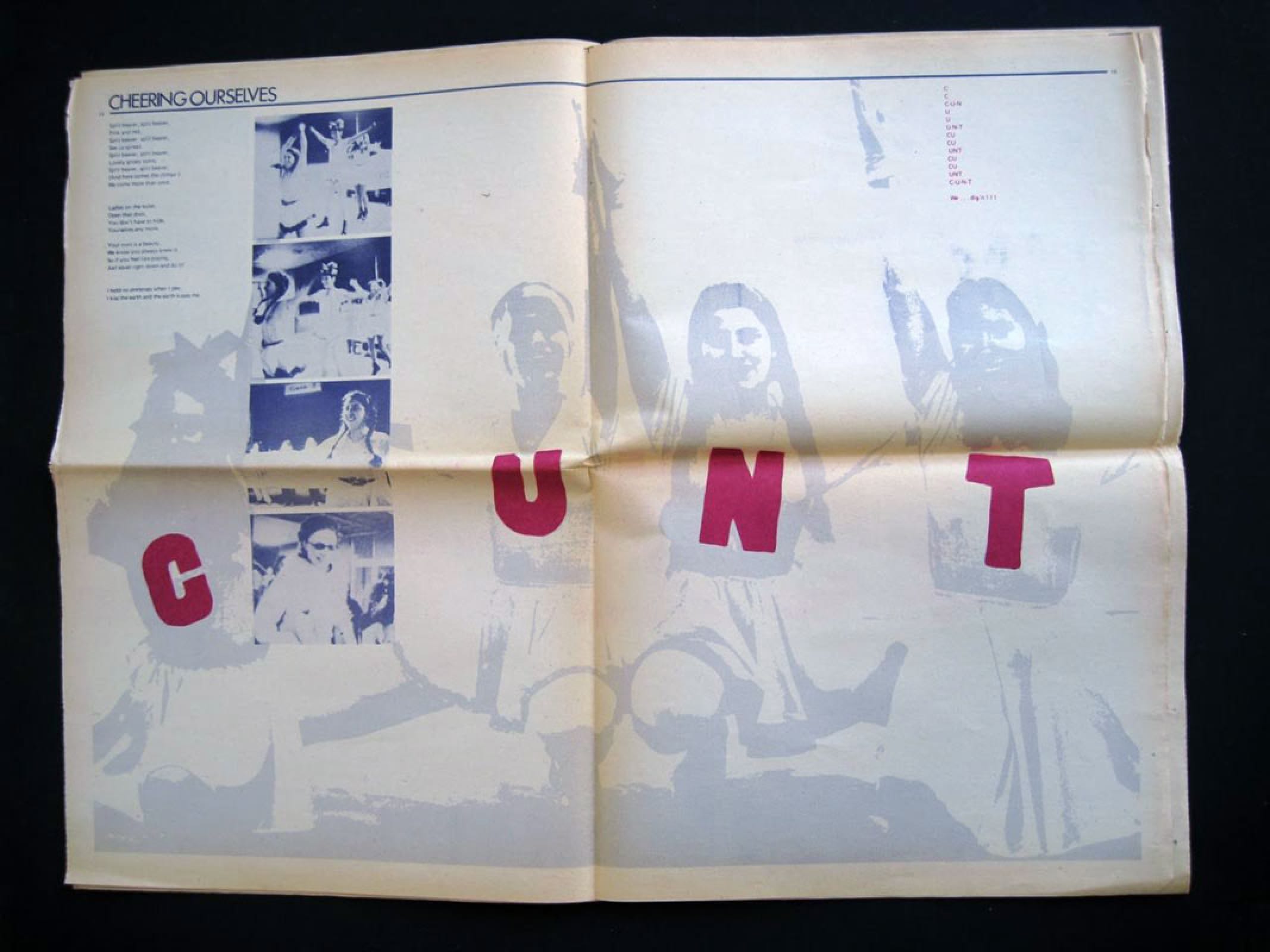
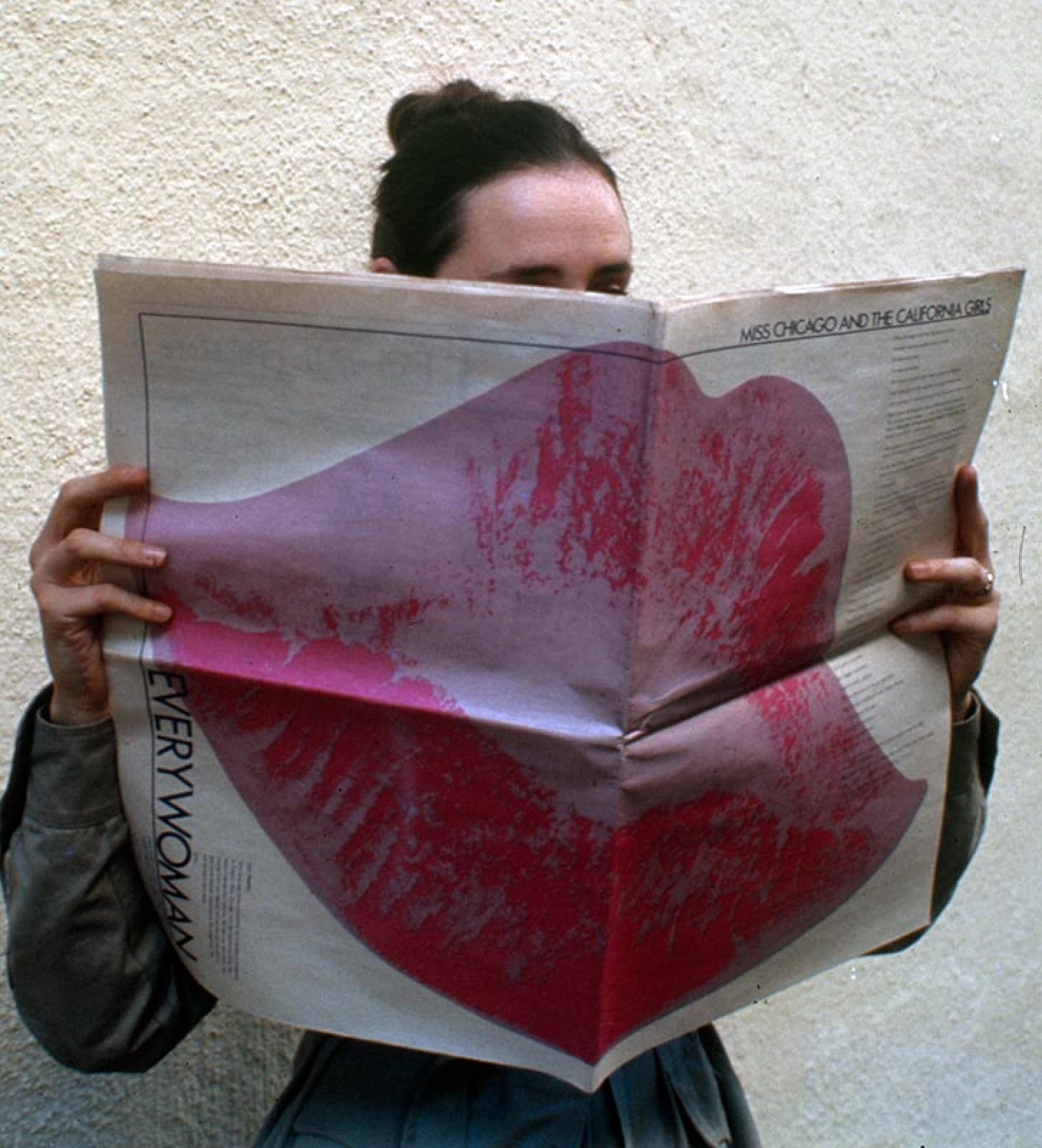
When the design arts are called upon to project aspects of the women’s movements, it is particularly appropriate to challenge existing assumptions about form and process. When I was asked by a group of women artists to design a special issue of Everywoman, a feminist newspaper, I tried to incorporate the visual projection of the egalitarian, collective form of the small group process. In weekly meetings, small groups of women throughout the country talk in turn so that those easily dissuaded from speaking by more vibrant, dominant personalities, are assured of being heard. In this Everywoman design I avoided the associations of space and length of article with quality, and gave each woman a large photo of herself and a two-page spread, regardless of the length of her copy, I tried to link the spreads visually and to make no spread dominant. Looking alike, the articles did not visually compete with each other for the reader’s attention; it was left to the reader to discern differences which might be subjectively more meaningful. In addition, I encouraged the women artists to stay within the limits of the budget and printing process used by the ongoing publication, even though they had access to special funds. It seemed that we could provide a more viable model if we did not inflate the object and participate in the existent attitude that whatever is technologically or financially possible must be made available—at least to a few.
Дизайнеров обучают находить в идее главное, но по факту это нередко приводит к тому, что от идеи остается только часть. Материал же, поданный фрагментарно, рассеянно, может увлечь читателей своей сложностью, тонкостью и неопределенностью. И хотя им привычнее выхватывать из текста чужие тезисы, но если они подумают над идеей достаточное время и будут к ней открыты, то смогут её присвоить.
Я пригласила студентов в свой класс в Калифорнийском институте, чтобы исследовать такой способ передачи информации, и предложила им сделать это на своем собственном материале. Я попросила их создать собственное целое. Нечто большее, чем просто сумма элементов. Одна студентка объяснила свое решение так:
«Скрытое присутствие целого затмевает его элементы. Мы распознаем отдельные символы, только если понимаем общий символический порядок (или по крайней мере, заключаем, что их можно объединить по смыслу)... Мужские руки описывают, определяют, предлагают, отталкивают, угрожают... все женские элементы дизайна — исключительно и гротескно чувственны; женское тело, по-видимому, обязано быть сексуальным, а прическа лишь окаймляет безликое место, отсутствие идентичности... Похоже, что есть много поверхностных механизмов культуры, и за ними почти не видно целостного человека. Вопреки постоянному сексуальному подтексту, вопреки значению, которое придается коммуникативным инструментам... вопреки рукам, что жестикулируют, обещают, угрожают ... всё это не трогает ... сами механизмы культуры на уровне визуальности, языка, психологии не так значимы, как целое.»
Когда сообщество привыкнет к неопределенности, сложности, хрупкости в дизайне и контенте, оно поможет нам делать собственные умозаключения, выражать субъективные мнения и делиться ответственностью. Я считаю, что это благо: Такой дизайн может вдохновлять.
Фрагментарная подача материала, с несколькими поворотными точками вместо одной кульминации, по характеру и ритму подобна онтологическому опыту женщины — а точнее, ее переживанию времени. Хотя такой метод позволял мне передать, что художественное сообщество находится в становлении, и вдохновить читателей к участию, сама форма визуальной организации больше отражала именно мир женщины.
Существует несколько видов женского труда — например, шитье стеганых полотен и одеял, — где целое образуется из фрагментов, которые добавляют, когда есть свободное время. И в способе создания, и в эстетике формы этих полотен присутствует организация с несколькими центрами. Когда женщины собираются, чтобы вместе ткать стеганое полотно, — это, как и само полотно, пример организации без иерархии. Очевидно, если женщина не нацелена на славу и деньги, то у нее другое восприятие времени, чем у мужчин и женщин, захваченных карьерой.
Линейность времени чужда как реальной структуре дня, так и ритму ежемесячного биологического цикла женщины. Мысли, освобожденные от искажений механического прогресса, сложны, они расслаиваются на множество нитей, повторяются и пронизаны множеством нужд других людей. Связи такого рода заставляют женщин думать не только о работе, но и о том, какие купить продукты, что приготовить на ужин, как лечить зубы детям и так далее, в промежутках между мыслями о работе. Домашний труд женщины столь же разнообразен и ничем не ограничен, воспитание детей тому классический пример. Тогда как домашний труд мужчины имеет начало и конец, это отдельные проекты: либо он чинит окна, либо приборы, либо занимается сантехникой.
Монтаж фрагментов, сборка форм в матрицы передают такое переживание времени, предлагают глубину и плотность как альтернативу прогрессу.
Дизайнерские практики призваны отразить аспекты движений за права женщин, но не только — необходимо бросить вызов общепринятым мнениям о форме и процессе. Когда группа художниц попросила меня сделать дизайн для специального выпуска Everywoman, феминистской газеты, я постаралась визуально передать, что такое эгалитарная деятельность небольшой группы. По всей стране еженедельно работают такие группы, в них говорят по кругу, так что даже робкие женщины могут быть уверены, что более яркие, доминирующие участницы не помешают им быть услышанными. В своем дизайне журнала Everywoman я избегала связывать количество места и длину статьи со статусом женщины — каждой полагалось большое фото и разворот, независимо от длины материала; я старалась визуально связать развороты между собой, чтобы ни один из них не доминировал над другими. — статьи визуально не борются друг с другом за внимание читателя; различия, которые могут быть субъективно более значимыми, — оставлены на его усмотрение. К тому же, я поощряла художниц работать в рамках бюджета и того типа печати, который мы выбрали для данной публикации, хотя они могли привлечь дополнительные средства. Мы считали, что создадим более жизнеспособную модель, если не раздуем проект и откажемся от идеи, что нужно сделать все финансово и технически возможное, даже если это возможно не для всех.
Designing a structure that will encourage participating, nonhierarchical, nonauthoritarian relationships between the designer and the user, also results in visual and physical forms that are outside the mainstream of design as much as these ideas and attitudes are outside mainstream culture. The way these publications look is different from the way our national publications look: this difference is much less the result of creating another style of designing structures which encourage different values. Desirable as it is that these values become diffused into society, such design structures are often modest in appearance, rather than powerful, elegant, simplified, clear and dynamic forms. perhaps the importance of dynamic visual relations should be questioned and quiet, literary forms reevaluated.
Design appears to be a particularly ambiguous enterprise and design for social change, even more so—in comparison with the other arts. The designer is often paid by those very institutions that would be affected by her attitudes in forming and shaping design: the contradictions for a freelance designer who wishes to effect social change is thus apparent. Because design is attached to the world of business and industry in this way, it is difficult to know in advance if one’s design will be used to reinforce values that the designer opposes.
Эти идеи и взгляды находятся вне культурного мейнстрима. Точно так же структура, которая поощряет участие, не-иерархические и не-авторитарные отношения между дизайнером и пользователем, порождает визуальные и физические формы вне дизайнерского мейнстрима. Такие публикации отличаются от стандартных журнальных публикаций в нашей стране: и дело не в том, что в них предлагается какой-то другой стиль — дело в том, что они развивают структуры, которые продвигают другие ценности. Хотелось бы, чтобы эти ценности распространялись в обществе, но такие структуры дизайна часто внешне сдержанны, это не яркие, элегантные, упрощенные, ясные и динамичные формы. Возможно, значение динамических визуальных связей стоит подвергнуть критике, а тихие, литературные формы, наоборот, переосмыслить.
В сравнении с другими искусствами дизайн оказывается куда более двусмысленным предприятием — и дизайн, поддерживающий социальные изменения, в особенности. За работу дизайнера платят подчас те же учреждения, на которые она должна повлиять своими профессиональными решениями: отсюда понятны метания дизайнеров-фрилансеров, которые хотят изменить общество. Поскольку дизайн в этом плане зависит от бизнеса и промышленности, сложно заранее сказать, не будет ли он использован, чтобы продвигать ценности, которым сам дизайнер противостоит.
Designers must work in two ways. We must create visual and physical designs that project social forms but simultaneously we must create the social forms that will demand new visual and physical manifestations.
Дизайнерам нужно работать в двух направлениях. Мы должны создать визуальные и физические решения, которые будут продвигать новые социальные формы, но одновременно нам нужно разрабатывать и сами социальные формы, которые потребуют новых визуальных и физических решений.
Those designs of mine which I have discussed are the products of situations in which I was called upon to give physical form to efforts to create new social contexts. In this case, the major thrust was to rethink assumptions — profit was not a consideration and the budget was modest, and the audience (unfortunately) was limited. In this way I was exempt from the pressures that make it difficult for a larger, moneymaking project. But as such situations are rare and because I could no longer separate physical and social design, I found myself needing to create an interface. I wanted to investigate the possibility of working with other women. I allowed myself to indulge the notion that this method would locate problems and design solutions free of the design system in which both commercial stars and commercial hacks were always subject to the pecuniary ethos. Further, without losing the social context implied in the activity of design, I had actively to erode the idea of design as a private activity. It has always been the public nature and responsibility of design that I have believed definitive. Accordingly, I initiated a Womens Design Program at California Institute of the Arts.
In this program I was able to explore the relationship between design and feminism. The personal and ideological involvement offered the opportunity of finding a sphere of action that allowed these values to survive, I wanted to give attention not so much to what could be produced as to an operative ethic. That does not mean that we were not to design using concrete forms, but points to the need to protect these ideas from being buried under the subservient design process. Working with communications, rather than object-making, made it easier to infuse a design with these attitudes.
It was clear to me that women designers could only locate and solve design problems in a responsive way if they simultaneously studied their own history, tried to isolate female values and worked cooperatively. I designed procedures and projects which could reinforce the idea that design is a social activity and that women working in the design arts must have an understanding of the technical, as well as the social aspects of media technologies.
The design and printing of Broadsheet 1 documented this investigation of design and feminism. Several of the early projects recorded in Broadsheet seem, on the surface, to have primarily technical goals, but they incorporated other values.Through the simple manipulating of bright red dots on a white ground, the women eased into an understanding of the simultaneous organization that allows people to see an image out of the dots and intervals in the half-tone process used in most publications. They learned this in an atmosphere that was intentionally playful and unthreatening. In an effort to recover a personal connection with work, the women investigated typographic conventions using language that had strong meaning for them individually. Playing with these meanings, they manipulated the forms to construct their own interpretations of it.
Just as these two ostensibly technical exercises were necessarily based on social values and contents, so the project of creating a photo-essay of another woman in the program was designed to help each woman gain control of the photographic medium as well as to express a relationship between the photographer and the subject which reflected their growing understanding of each other. I planned a group project for the Women’s Design Program the problem was to be defined and explored in terms of our experiences as women, and the solution attempted as an ensemble. As a result, I suggested that we should design a presentation of menstruation to girls. While we looked at material currently in use, the examination of our own experience was the real starting point for this group. We found it necessary to create material which would provide an alternative to the films and brochures linking menstruation with uncleanliness and an incapacity for physical and emotional self-control, while the ’positive’ aspects were linked to marriage and childbearing.
We videotaped our own discussions of this material and later, looking at videotapes of our talks, we were struck by the cogency of hearing about the variety of experience of menstruation in the context of real people’s lives. We decided on this format as our design solution.
We invited groups to the studio and videotaped their discussions of menstruation, calling the project Learning from Women’s Experience. Technical proficiency was acquired in the process of making videotapes, as each woman had a turn at being director, assistant director, camerawoman, or in charge of sound, light, etc. We taped young girls talking about the deficiency of information on menstruation, about their conflicts and questions. The talk ranged — some wanted to remain tomboys, others felt uncomfortable with the boys who had been their friends until this time, and many were confused about their capability to have children when they felt they were too young then or might never desire them. We tried videotaping discussions with males in the hope that including them in the talk would encourage integrated audiences where young boys and girls could engage in open discussion of their feelings after seeing the tape. But the tapes with both younger and older males were very strained by the difficulty they encountered in understanding this experience for which they had no analogy in their own lives, and from which they felt excluded, shameful, fearful, and yet curious.
We taped a group of older women who reminisced about the conspiracy of silence on the subject and their experiences, including the menopause. Their tape was the most exciting, not only because they generously shared their richness of longer lives, but because their open and honest exchange of experience illuminated the problem of menstruation as a continuum in women’s lives.
Even in this project we had to wrestle with the linking of emotionality and women. When we learned from a woman doctor that there were psychological causes for the emotional intensity some of us experience before menstruation, our first judgement was that this emotional reaction was unfortunate. But soon we saw this as good — perhaps this menstrual state would not seem deviant in a society that was not so committed to controlled rationality. In this project of designing educational material, we realized how important it is to provide an alternative to the presently available materials that oppose the devaluation of ‘female’ characteristics as an instrument in the unthinking discrimination against women.
We were also, perhaps obliquely, providing more emotional latitude for men.
The work of the Women’s Design Program was, to some extent, a retreat from the public world of business and industry where most of the design activity takes place. Our progress led me to realize how vulnerable women were to those values, which coalesce to deny us, in even our most private sectors, an appreciation and an understanding of our femaleness. Originally, I had been sensitive to the relegation of ’female’ values to the home, but now I saw that even in her most private house (her body), woman is not able to live openly and knowledgeably. I knew that to liberate the private self, we must understand and alter the public realm.
Мои дизайнерские работы возникали в ситуациях, когда от меня требовалось придать физическую форму новым социальным контекстам и попыткам их создать. В этом случае главной задачей было пересмотреть базовые допущения — выгода не рассматривалась, бюджет был небольшим, а аудитория (к сожалению) — ограниченной. Таким образом, я была свободна от давления, которое предполагает более крупный, прибыльный проект. Но поскольку такие ситуации редки, а я больше не могла разделять физический и социальный дизайн, то я поняла, что мне нужно создать некоторое пересечение между ними. Я хотела исследовать возможности работы с другими женщинами. Я позволила себе принять мысль, что этот метод ставит проблемы и разрабатывает решения вне той системы дизайна, где и звезды, и рабочие лошадки подчиняются материальной этике. Более того, я должна была, не утратив социальный контекст, который подразумевает дизайнерская работа, активно подрывать идею дизайна как частного занятия. Я твердо верила в том, что дизайн должен иметь общественную природу и публичную ответственность. Поэтому я учредила Women’s Design Program (Программу дизайна для женщин) в Калифорнийском институте искусств.
В рамках этой программы я могла исследовать связи между дизайном и феминизмом. Так как я была лично и идеологически вовлечена, у меня была возможность найти такую сферу действия, которая позволила бы сохранить эти ценности. Я хотела сосредоточиться не на том, что мы могли произвести, а на самой деятельной этике. Это не значит, что мы не использовали в дизайне конкретные формы, но скорее говорит о том, что мы не хотели потерять свои идеи, увлекшись вторичными дизайн-процессами. Так как мы больше работали с самой коммуникацией, чем производили вещи, нам было проще выразить в дизайне наши взгляды.
Мне было ясно, что дизайнерки могут оперативно ставить и разрешать проблемы дизайна только если они будут работать вместе, изучать свою историю и пытаться выделить женские ценности. Я разработала эту программу и проекты, чтобы распространить идею о том, что дизайн — это общественная деятельность, а дизайнерки должны понимать как технические, так и социальные аспекты работы с медиа.
В дизайне и подготовке к печати работы «Broadsheet 1» нашло отражение мое исследование дизайна и феминизма. На первый взгляд кажется, что ранние проекты, показанные в ней, решают технические задачи, но они включают в себя другие ценности. Путем простых манипуляций c красными точками на белой поверхности женщины знакомились с полутоновыми (halftone) изображениями, которые используются в большинстве публикаций. Полутоновые изображения позволяют людям видеть за точками и интервалами конкретные образы. Женщины исследовали этот эффект в обстановке безопасности, в атмосфере игры. Они изучали типографские конвенции, и чтобы восстановить личную связь с работей, каждая участница использовала язык, который был важен именно для нее. В игре смыслов они управляли формами и выстраивали собственные интерпретации.
С виду оба эти упражнения носили чисто технический характер — но в сущности они были основаны на социальных ценностях и содержаниях. В еще одном проекте каждая участница программы делала фото-эссе про другую участницу; проект помогал женщинам как обрести контроль над медиумом фотографии, так и отразить связь между фотографом и моделью, которая передавала бы, как они постепенно узнают друг друга.
Я задумала групповой проект для Women’s Design Program (Программы дизайна для женщин), задача была в том, как определить и исследовать проект в рамках нашего женского опыта, и решение пришло в виде групповой выставки. В результате я предложила сделать дизайн презентации о месячных для девочек. Так как мы искали актуальный материал, по-настоящему наше исследование началось, когда мы обратились к собственному опыту. Мы решили противопоставить наш проект фильмам и брошюрам, где менструация ассоциируется с нечистоплотностью и неспособностью к физическом и эмоциональному самоконтролю, а ее «положительные» аспекты связываются с браком и рождением детей.
Мы записали наши обсуждения на видео и позднее, просматривая видеозаписи, были поражены тому, насколько убедительно реальные люди рассказывали о самых разных переживаниях менструации. Мы решили, что такой формат будет нашим дизайнерским решением.
Мы пригласили группы в студию, записали на видео их обсуждение менструации и назвали проект Learning from Women’s Experience. Каждая женщина была то режиссеркой, то помощницей режиссерки, то операторкой, то звукооператоркой, то ответственной за свет и т.д. — так мы развивали наши технические навыки. Мы записали, как юные девушки говорят о недостатке информации по менструации, о конфликтах и проблемах. Разговоры были самые разные: одни хотели остаться пацанками, другие чувствовали себя неловко рядом с мальчиками, с которыми раньше дружили; и многих смущало, что они способны иметь детей, но еще слишком молоды или могут не захотеть детей вообще. Мы попробовали записать обсуждения вместе с мужчинами — мы надеялись, что такие ролики воодушевят зрителей, юношей и девушек вступить в открытую дискуссию. Но записи как с юношами, так и со взрослыми мужчинами были напряженными: им было сложно понять опыт, для которого у них не было аналога в жизни. Обсуждая месячные, они чувствовали себя исключенными: им было стыдно, боязно, и все же их одолевало любопытство.
Мы записали на видео, как женщины постарше вспоминали о заговоре молчания вокруг их переживаний, связанных с месячными и в том числе — с менопаузой. Эта запись была самой удивительной, потому что они щедро делились своим богатым опытом, открыто и честно обсуждали тему, освещая проблему менструации как части жизни женщины.
Даже в этом проекте нам пришлось сражаться с ассоциацией эмоциональности и женщин. Мы узнали от женщины-врача, что у острых эмоциональных переживаний, которые испытывают некоторые из нас перед месячными, есть психологические причины. Сначала мы решили, что такая эмоциональная реакция неправомерна. Но вскоре мы увидели в этом благо: возможно, если бы общество не было настолько преданно контролю и рациональности, предменструальное состояние не показалось бы отклонением. Разрабатывая образовательные материалы, мы осознали, как важно дать альтернативу существующим материалам о месячных; такая альтернатива противостояла бы бездумной дискриминации женщин через обесценивание «женских» качеств. Также мы, возможно, косвенно, дали больше свободы эмоциям мужчин.
Работа Women’s Design Program была в определенной мере спасением от публичного мира бизнеса и индустрии, где происходит большая часть дизайнерской деятельности. Наше движение позволило мне понять, насколько уязвимы женщины перед ценностями, которые не дают нам осознавать и уважать — даже в самых частных вопросах — нашу собственную женственность. Изначально я была чувствительна к ограничению «женских» ценностей домашней сферой, но теперь я увидела, что и в самом приватном из миров (в собственном теле) женщина не может жить открыто и доверять своим знаниям. Я понимала, что для освобождения самого приватного в нас мы должны понять и изменить публичное пространство.
One way for design to alter the public realm is to develop images of the future which embody female values and can permeate our contemporary society.
Один способ изменить публичное пространство с помощью дизайна — разработать такие образы будущего, которые бы включали в себя женские ценности и могли распространиться во всем обществе.
To do this successfully, we must know what forms most communicate the discrepancy between male and female values, devaluate femaleness, and cannot incorporate such modes as emotionality, complexity, and supportive cooperation.
The rigid separation of work and leisure, attitudes and values, male and female — which we noted above, is reinforced by the tradition of simplification in the mass media and it also operates in product and environmental design. A few new voices were raised in the sixties who appreciated, not only complexity and contradiction, but the value of participation in the popular vernacular. However, the connection and response to the multiplicity of human potential was lost as their attitude became style and fashion.
Чтобы достичь успеха, нам следует знать, какие формы лучше всего передают разрыв между мужскими и женскими ценностями, обесценивают женственность и не могут вместить установки на эмоциональность, сложность и взаимную поддержку.
Как мы отмечали выше, жесткое разделение труда и отдыха, взглядов и ценностей, мужского и женского поддерживается за счет традиции упрощения в СМИ; это разделение работает и в продуктовом, и в средовом дизайне. В 1960-е годы появилось несколько новых голосов, которые ценили не только сложность и противоречивость, но и активную связь с повседневной культурой. Однако эта связь и внимание к многообразию человеческого потенциала были утрачены, когда их взгляды вошли в моду и стали выхолащиваться.
First published in lcographic 6 (Croydon, England: 1973)
Russian text translator: Alexandra Moroz
Russian text editor: Sergey Astkahov
Developer: Sergey Zakharov
Criticism.online is a experiment in slow media publishing. It is a bilingual publication meant to bring best critical texts on design to English and Russian speaking audience. Occasionally, we translate articles and post links to the resources we find worth reading. No deadlines, no rush, no agenda. Follow our irregular updates here.
Впервые опубликовано в lcographic 6 (Croydon, England: 1973)
Переводчик: Александра Мороз
Редактор: Сергей Астахов
Разработчик: Сергей Захаров
Criticism.online is a experiment in slow media publishing. It is a bilingual publication meant to bring best critical texts on design to English and Russian speaking audience. Occasionally, we translate articles and post links to the resources we find worth reading. No deadlines, no rush, no agenda. Follow our irregular updates here.